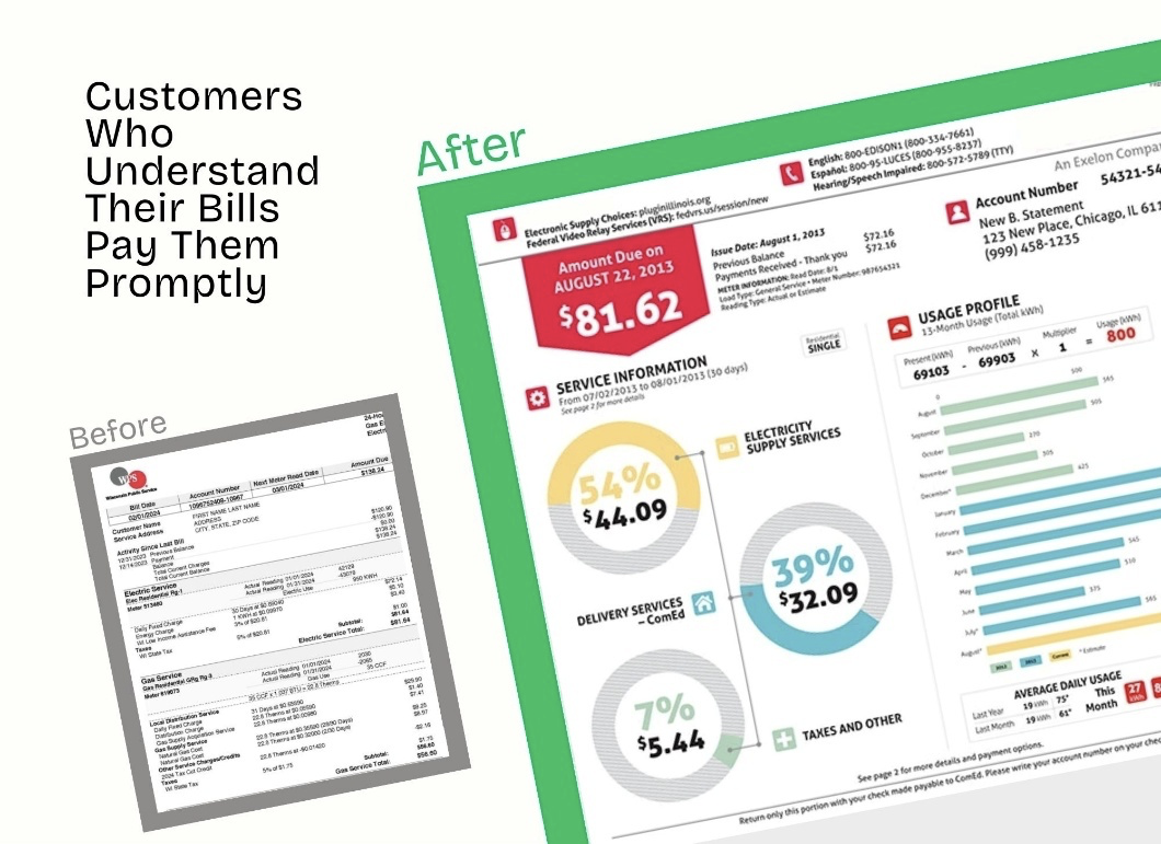
Your utility bill isn’t just a piece of mail—yet many utilities still send bills that lack clarity, or don’t include critical information which frustrates customers and delays payments. The good news? Applying basic design principles can transform your bill from overwhelming to effortless to understand.
Here’s a few design tips for utility bills that get read and paid quickly.
Important information is boldest and biggest in utility bills
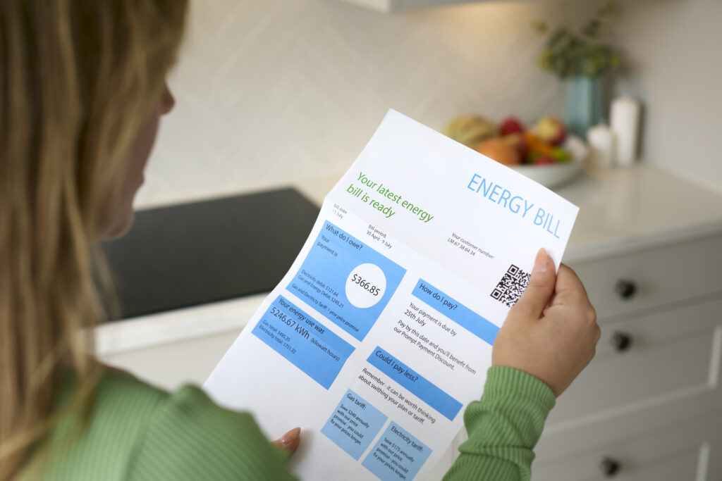
The two second rule: Your customer should know within two seconds how much they owe and when it’s due. Visual hierarchy guides the reader’s eye to what matters most, in the right order.
Start with the most critical information at the top: amount due and payment due date. These should be the largest, boldest elements on the page. Next are account details and billing period. Supporting information like usage charts and rate schedules can appear lower on the page.
Use contrast for readability
Use contrast strategically in your utility bill design. High contrast for essential information: black text on white backgrounds, or reverse type (white text on dark backgrounds) for calls to action like “Amount Due: $127.45.”
Color can enhance contrast as well as meaning—a red “Past Due” notice or a green “Auto-Pay Enrolled” status immediately communicates clearly.
Avoid light colors, pastels, or grey. If your customer can’t read it easily, they’ll either call your service center or ignore it entirely—both bad outcomes.
Emphasize what requires action in utility bills
Emphasis in design directs attention to specific elements that you want your customer to act upon. But use it sparingly—if everything is emphasized, nothing stands out.
Bold the payment amount. Box, shade or highlight the payment stub customers need to return. Use icons to highlight new messages like rate changes or service alerts. A simple “Due in 5 Days” draws the eye immediately. Emphasis helps customers take action.
Resist the temptation to emphasize legal disclaimers and regulatory text. Yes, it needs to be there, but it doesn’t need visual prominence. Remember your goal for the design is specifically to make it easier for your customer to understand and pay.
Embrace white space
Think of white space as a design element, not wasted paper. White space is the blank areas around your logo, text and graphics. Customers process simple, spacious layouts (lots of white space) faster and with less frustration.
Separate sections with adequate spacing. Don’t let your usage chart bump against payment information. Create clear margins. Leave space around your call-out boxes. White space signals where one topic ends and another begins.
Clear calls to action
All efforts to design or redesign your utility bill should guide customers toward the desired action: making it as easy as possible to pay that bill.
Create a distinct “Payment Options” section with clear, actionable choices:
Pay Online: (URL)